Monday, December 31, 2007

Wednesday, December 26, 2007

Selective Sepia

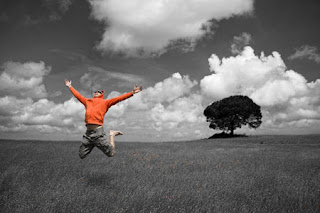
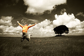
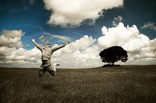
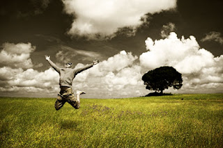
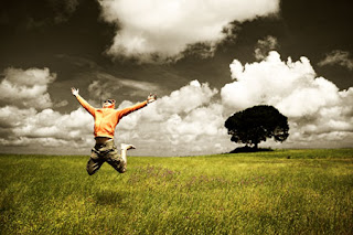
Learn how to use Photoshop to create selectively add a dramatic sepia effect a photo. This Photoshop effect works best when used with Photoshop CS3 but will also work with Photoshop CS2 or older using an alternative method.

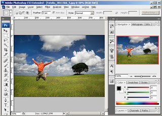
Step 1: Open an image into Photoshop

Open the File menu and select Open. Browse for the photo you would like to add a selective sepia effect to and click OK.


Step 2: Create a Hue/Saturation adjustment layer

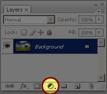
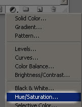
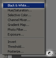
In the Layers pallet, click on the New Adjustment Layer icon and select Hue/Saturation.


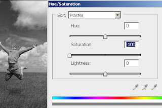
A Hue/Saturation window should appear. With this tool, we'll specify where the sepia effect will appear. Decide if you want to select the sepia toned areas according to the color of the image or by manually painting the areas where you would like the sepia tone.

Choose one of the following:

A) Select by color

Selecting the sepia areas based on color will give the most natural effect.

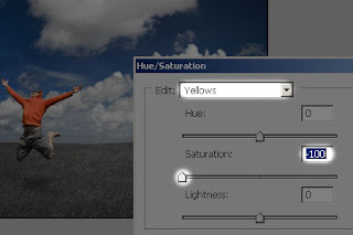
First, decide which color in the photo that you want to keep. Then, select from the edit drop down menu the each color in the list except for the colors you want to keep and reduce the saturation to -100. For example, to keep the reds in the photo use the following settings:

Reds: 0 Saturation
Yellows: -100 Saturation
Greens: -100 Saturation
Cyans: -100 Saturation
Blues: -100 Saturation
Magenta : -100 Saturation


B) Select manually

Manually selecting the sepia toned areas will let you specify precisely the area that you would like toned.

Set the master saturation to -100 and click OK. Your image should now appear grayscale.


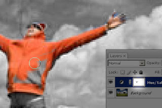
Activate the layer mask by clicking on the layer mask thumbnail in the Layers pallet. Select the Eraser tool and erase the areas where you don't want the sepia tone to be applied to.


Step 3: Add a Black & White adjustment layer

In the Layers pallet, click on the New Adjustment Layer icon and select Black & White. If you are using Photoshop CS2 or older, select Hue/Saturation instead.


A Black & White (or Hue/Saturation if you're using Photoshop CS2 or older) adjustment layer should appear. Simply click OK without editing the settings. Then, change the blend mode of the top adjustment layer to Overlay. Double click back on the icon of the layer to bring back the tool.


Photoshop CS2 or older:

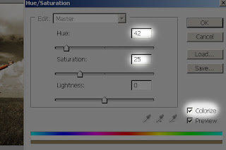
You will be using the Hue/Saturation tool to add a sepia tone. Checkmark "Colorize" and apply the settings below:


Photoshop CS3:

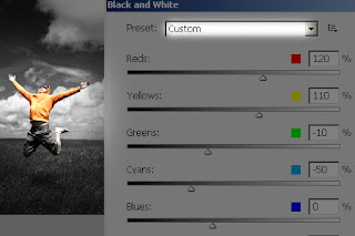
If you're using Photoshop CS3, you can use the Black and White adjustment to add a sepia tone. This will give you more adjustable settings compared to using the Hue/Saturation adjustment.

First, adjust the settings to get the black and white look that you like. Or, you can scroll through the presets menu to select one of your own. I chose the Red Filter preset to bring up the reds and darken the sky.


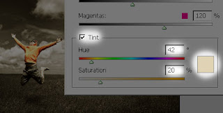
Checkmark the Tint and adjust the tone to create a sepia effect. Click OK when done.


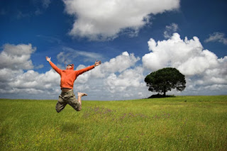
Original Image:


Final Result: with Red


Final Result: with Blue and Cyan


Final Result: with Yellow and Green


Final Result: with Red, Yellow and Green

Sunday, December 23, 2007

Genuine Fractals Print Pro 5.04 for Adobe Photoshop

The Photoshop plug-in Genuine Fractals Print Pro 5 is a revolutionary step forward for image enlargements. We've taken the industry standard and given it a complete overhaul. New scaling technology, faster performance, new features, new user interface, greater ease of use and much more. Compare Genuine Fractals Print Pro 5 to any Photoshop scaling method or other third party plug-in, Genuine Fractals Print Pro 5 is the industry standard in image resizing.

New Features:

New scaling algorithm - We overhauled the patented scaling algorithm to now allow for over 1000% enlargements with no loss in detail

Multi-processor Support - Optimized for multiple processors, including CPU hardware acceleration (SSE/AltiVec), up to 10x faster than the previous version

Document Size Presets - Crop and resize your image in a single step

Robust Layer Support - Supports Layers, Paths & Alpha Channels

Texture Controls - Get that extra bit of detail out of your images

Sharpening Controls - Save time by sharpening for output right in Genuine Fractals

Film Grain Controls - Add simulated Film Grain for and extra sharp look

Photoshop Action Support - Record actions for multiple sizes, batch process an entire folder easily

New User Interface - Make your image the star of the show, not just a bunch of dials

Support for Photoshop CS3 - Universal Binary means fast native support for Intel processor powered Macintosh systems

LAB Color Mode Support - Added Support for 8 & 16-bit LAB & Grayscale images

"Show Me How" Tutorial Videos - New built-in videos so you get the most out of Genuine Fractals

Automatic Update Checking - Make sure you always have the latest version

The Industry Standard for Image Enlargement

Genuine Fractals 5 is the industry standard for image resizing. It's renowned across the photographic and printing industries for its ability to increase image size well over 1000% without the loss of sharpness or detail that you would normally expect. Its patented, fractal based interpolation algorithms work like nothing else and the results speak for themselves.
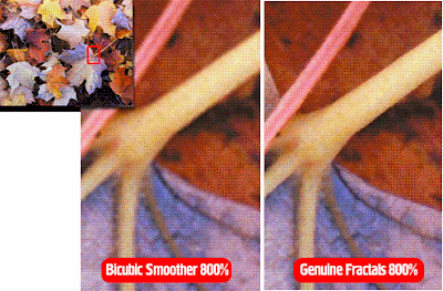


Genuine Fractals Print Pro 5 can resize your images over 1,000% and still maintain sharp edges and minute details. It is a must for any photographer who makes large format and poster sized prints. Its also great for journalists, sports and wildlife photographers who may need to take a cropped section of an image and still make a high-quality print from it. Genuine Fractals Print Pro 5 can even work its magic with digital video still frames and even camera phone images.

Graphic designers can end the everyday problem of receiving low resolution images from clients for high resolution print work such as magazine publications or tradeshow and billboard graphics. Genuine Fractals Print Pro 5 additionally supports 8 and 16-bit CMYK images for use direct use in the pre-press workflow. Stop making blurry, artifact infected prints � get Genuine Fractals Print Pro 5.

more info @ http://www.ononesoftware.com/detail.php?prodLine_id=7

Download: Click Here

Monday, December 17, 2007

Dramatic Black & White Photos

Dramatic Black & White Photos
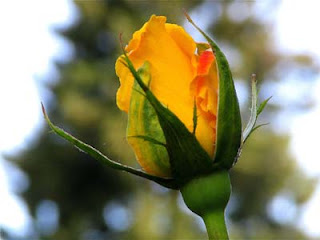
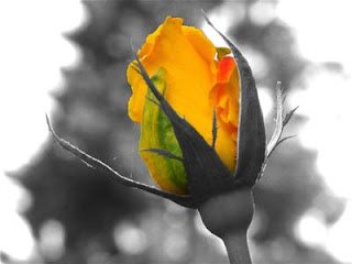
Create dramatic black and white photos by splashing in color.


1. Open a color photo in Photoshop.


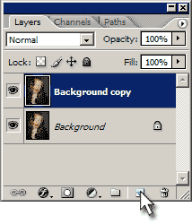
2. Duplicate the layer by dragging the layer to the "Create a New Layer" icon in the layers palette (or CTRL+J).


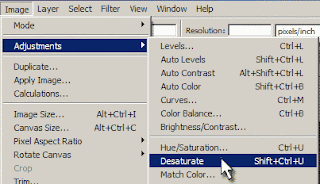
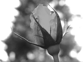
3. With the new layer selected, goto Image > Adjustments > Desaturate (or Shift+CTRL+U).


4. Goto Image > Adjustments > Brightness/Contrast and adjust the levels for each so that the black & white photo looks pleasing to your eye.


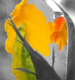
5. Now select the Eraser tool and erase whatever areas you want color. In this example, I erased the flower so that it's color would shine through.


Invite Rain

Invite Rain:
This Tutorial will show you how to add realistic rain to your photo. you will do that using Photoshop And ImagReady.


STEP 1 :
Open an image and create a new layer and place the new layer over the image layer in the layer palette .choose paint bucket tool and fill the new layer with black.
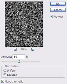
choose filter>> noise >> add noise and adjust settings as follow.


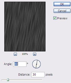
choose filters >> blur >> motion blur and adjust settings as the following:


STEP 2:
create anew layer and place it over the other layers in the layer palette and fill it with black as we do before in the other layer.
Also Apply the add noise filter but increase the amount to "61" instead of "60" and then apply the motion blur filter with the same previous settings.

try this step 2 times but when u apply the noise filter you must increase "1" to the amount (i.e. the 3rd layer "62" and the 4th "63".

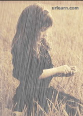
Now change the mode of all 4 layers to screen and then change the fill of all layers to 60.

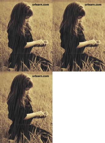
you should see you project like this image:


STEP 3:
select file >> Edit in ImageReady .
in the imageready show the animation palette and layers palette if they are invisible:
To do that :
choose Window >> Timeline
Window >> Layers.

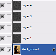
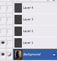
in the animation window at the first frame go to the layer palette and make all layers invisible except the basic image layer and one layer.


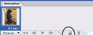
After that create a new frame in the timeline. by clicking the "Duplicate current frame" button which is surrounded by a circle in the following image:


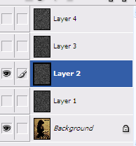
Select the new frame and go to the layer palette and hide the already visible layer and make another one visible. as you see in this image.

Repeat this process until you have 4 frames each one contains the basic image layer with only one rain layer.

After that set the time of the frames to 0.1 second


Select file >> Save optimized as .

This is the Final result:

Friday, December 14, 2007

Creating Blood Text

Here we will writing some text...in blood! To start off we need a good place for our blood to spill, how about a wooden table? I used the texture below.


Next we need to make our text. Above your wooden table layer, create a new layer and fill in with white. Next use your text tool to write your words. Try to pick a rounded-font, and choose a weight of "bold." After you have written everything you want, rasterize your text by right clicking on your text with the text tool and choosing "rasterize type."


Merge your text layer with the white layer below it by pressing Ctrl+E. Next take out your brush tool. Choose a style that has very little blur, and use it to make some random black blotches around your text.


Blur your layer by choosing Filter > Blur > Gaussian Blur.


Now we are going to play with the levels a bit to remove the blur, afterwards we will have a much more rounded text. Choose Image > Adjust > Levels. Adjust the bars until you have something similar to mine.


Your text should now have lost its blur, however, the blotches and text will have "merged" together somewhat. Now we need to select our text and blood drops, to do this we are going to select by color. Choose Select > Color Range. Use the eye dropper and click on a black portion of your canvas. Click ok, and your text should be selected.


Delete your layer, revealing the wooden texture below. Create a new layer and fill your selection with a dark red to medium red gradient.


Choose Layer > Layer Style > Bevel and Emboss. Use the settings below. Don't forget to click on the contour dropdown menu, and choose the image shown below.


Choose Layer > Layer Style > Drop Shadow. Use the values below.


Your text should be looking pretty blood-like by now. For a final finishing touch I blended the wooden texture into my text to make it look slightly translucent. To do this, copy your wood text, Ctrl Click your text layer to make a selection, and choose Edit > Past Into. Change the layer mode to overlay and bring down the opacity into you have you have a nice tint of red. Your done! Here is how mine turned out.


Thanks source from: voidix.com

Thursday, December 13, 2007

Focal Points

Learn how to make your users/viewers focus on a certain part of a picture in this focal point tutorial.

1.Select Image

I used the image below, feel free to use your own image:


2.Draw circle

Now select the Elliptical Marquee Tool from the toolbar. Hold shift and make a circle over the part you want the image to be focused on, I put the circle over the surgery. After making your select go to Select>Inverse. Your selection should look like this:


3.Copy and Paste

Now go to Edit>Copy then Edit>Paste. Your layers window should look like this:


4.Apply Radial Blur

Now on the Layer 2 you need to apply Filter>Blur>Radial Blur. And use these settings:


There you go, you are done. Here is my focal point effect:

Tuesday, December 11, 2007

Professional Auto Color Setting

Have you ever noticed how the auto correction tool in photoshop doesn't always do a very good color correction. I know I have. I was so fed up with it that I rarely used it due to undesirable results I would always get.

In this tutorial I will show you how to setup your auto color correction tool so that it operates like it's supposed to.

Step 1:
Open a file that needs color correction. Often times images turn yellow or red as they get older.


Step 2:
Open the levels palette or click ctrl+L if you like using short cuts. Click the option button to reveal some hidden settings.


Step 3:
By default the "Enhance per channel contrast" is selected which will give you some pretty lame color correction. You will want to select "Find dark and light colors" and check "Snap Neutral Midtones" as well.


Step 4:
Under target colors and clippings you will want to set the "Shadow, Midtones, and Highlights.


Step 5:
Click each one's color box and set as follows:
Shadow R=20 G=20 B=20
Midtones R=128 G=128 B=128
Midtones R=240 G=240 B=240
Check the lower left "Save as Defaults" and click OK.


Step 6:
Your image should be corrected. Now in the future when you want to do this all you will need to do is go to Image->Adjustments->Auto Color or Shift+Ctrl+B