Sunday, June 29, 2008

Vintage Clouds Photoshop Tutorial

Step 1

As usual, start by opening any photo into Photoshop. Of course, the photo should have a sky with some clouds.


Step 2

Create a selection of the sky. To do this, you can use any selection tools such as the Quick Select tool or the Magic Wand tool.


Step 3

With the selection still active, in the Layers palette, click on thebutton and choose Levels.


This should bring up the levels tools. You should also see in Levels adjustment layer that the selection applied to the layer mask.


Step 4

In the Levels tool, select Blue from the Channel drop down menu. Then, move the black input slider towards the right until the skies start turning yellow. Don't click OK yet!


Step 5

Then, select the Red channel from the Channel drop down menu and move the white input slider towards the left just a little. Don't click OK yet!


Step 6

Finally, select back the RGB channel from the Channels drop down menu. Move the black input slider towards the right to increase the contrast of the clouds. Now you can click OK when you're done.


Step 7

If you want, you can also add a lens flare. Select the Background layer then choose Filter > Render > Lens Flare.


Final Results


Before and After

Sunday, June 22, 2008

Create a Layered Glowing Text Effect

In this tutorial, we will create this effect using very basic Photoshop tools and layering effects. This tutorial is simple enough for a beginner to understand, but I should warn you that in this tutorial there ends up being over 60 active text layers, which will require a heavy use of your computer's memory. Let's jump into this tutorial and layer some glowing text.

Final Image Preview

Before we get started, let's take a look at the image we'll be creating.


Step 1

Make a new document that is 2000px by 1200px. Then make a new Gradient Adjustment Layer with a linear gradient that goes from a dark gray (#464646) at the bottom to black (#000000) at the top. This will be our background base.


Step 2

Make another linear Gradient Adjustment Layer above the previous one, and make it a rainbow of colors of your choice. There are some colorful presets that you can choose from in the gradient palette, or create your own. Set the layer's Fill down to 25%. Then set the layer's blending mode to Color.

Tip: When you set the blending mode to color it makes it so the layer only affects the color of everything below it, while leaving the lightness/darkness alone.


Step 3

Finally make another Gradient Adjustment Layer above the previous two. This one will be a radial gradient. Set this one up so that the only 2 colors in the gradient are black and then make the transparency go from 100% at one end and 0% at the other end.

If you see that black is covering the center of the image, check the Reverse box. Then make it so the black goes around the edges of the canvas. Set the layer opacity to 65%. I moved the transparency handles around a little to get the exact effect that I wanted.


Step 4

Now lets begin with the text treatment. Hit (T) for the type tool, and make a (single click) on the canvas. Then type your letter, in my case a P. Then grab the Move tool and (Hit CMD+T) and transform the letter, adjust it until it's the size that you want it. Hit (T) again for the type tool, and if it's not already, make the letter black by clicking the text color box in the property bar. Set the letter layer's blending mode to Screen. The letter will disappear.


Step 5

(Double click) to the right of the letter layer's name in the layer palette to bring up the layer styles palette. Put an Outer Glow and a Stroke on the layer with the exact settings that you see below. You will see a very faint image of the letter now.

Let's use this first letter as a starting point for all the text in the image. Once we layer several different letters on top of each other, our effect will come to life.


Step 6

Duplicate the letter layer by dragging it down to the New Layer button at the bottom of the layer palette. Select the type tool (T) and then change the font on the new layer. If the new font doesn't line up how you want to hit (CMD+T) to free transform the new letter. Make sure that you always line up the baseline of the letters. You can move the anchor point to the base line when you are transforming to keep it lined up correctly.

Now do this step 20 times, each time using a different font. I chose to use all different fonts that have serifs. You can use all fonts that are sans-serif if you like, but I wouldn't mix the two.


Step 7

Select all the text layers that you have. Then hit (CMD+G) to group them. With the group selected in the layer palette, hit (V) for the move tool. Then (while holding ALT), click and drag on the letters on the canvas to duplicate them. Drag them to the right where you want the next letter to be. Now there should be 2 groups of text in the layer palette. Turn off all the letter layers in the new group (except the bottom one) by clicking in the little 'eye' icon next to each one.

Now select the text tool (T), and highlight the single letter. Then change it to the next letter that you want, in my case an S. Finally, turn the S layer off. Then turn on the next one and do the same. Repeat this until all the letters in your new group are changed. Turn all the layers back on.

Repeat this step for each new letter you need.


Step 8

Select the elliptical marquee tool and make a very thin ellipse at the base of your letters. Then Feather the selection about 20px. Enter quickmask mode (Q). Then go to Filter>Blur>Motion Blur. Make the angle 0 and the length 700px and hit OK. This gives us a nice fade out to the left and right sides. Then exit quickmask mode (Q).

Now make a curves adjustment layer above the gradients, but below the letter groups. Then apply a curve that looks like the one below. This just gives our letters something to sit on.


Step 9

Make a new document that is 300px by 300px. Double click on the background layer to make it an active layer. (Double click) to the right of the layer name to open the layer styles palette. Apply a color overlay to make the layer black. Then add an inner stroke that is white to make a border. You can see my settings below.

Go to Layer>Flatten Image to flatten the image. Hit CMD+A to select all and then go Edit>Define Pattern.


Step 10

Go back to your other document. Make a new blank layer just above your curves layer by hitting the New Layer button at the bottom of the layer palette. Not go to Edit>Fill and select Pattern for the Contents. Then select your black box that should be at the end of the list, and hit OK.

Now Hit (CMD+T) to transform the layer so that it fits in the foreground space. Then (right/control+click) anywhere in the transform box and select perspective. Drag the bottom right handle way out so you get a nice perspective on the pattern layer. Set the layer's blending mode to screen and the opacity to 15%.


Step 11

There is one last step to add a finishing touch. Select the type layers and duplicate them by dragging them down to the New Layer button. With the new groups selected hit (CMD+T) then (right/control+click) in the transform box and select Flip Vertical. Move them down so they look like a reflection.

With all the reflection groups selected hit (CMD+G) to put them into another group. Set that group's opacity to 25%. Add a mask to the group by clicking on the Add Layer Mask button at the bottom of the layer palette. With the mask selected hit (G) for the gradient tool and apply a linear gradient from black to white, so the reflection fades out as it goes down to the edge of the image.


Conclusion

Monday, June 16, 2008

Focus Magic 3.0.2 for Photoshop


Focus Magic uses advanced forensic strength deconvolution technology to literally "undo" blur and recover lost detail. It can repair both out-of-focus blur and motion blur (camera shake) in an image.

Focus Magic, which is used by many forensic scientists, is the only photo sharpening software that can recover detail. You can use this powerful tool to sharpen your blurred photos right now. Unlike other sharpening software, Focus Magic increases the "actual sharpness" (with deconvolution) rather than the "perceived sharpness" (with unsharp mask or
equivalent).

At the time that we wrote Focus Magic, we thought that it would only be used for photos that are noticeably blurred. We were surprised to find however, that nearly all photos can be sharpened with Focus Magic. A lot of our users run all their photos through Focus Magic with a Blur Width of 2. Some professional photographers have also commented that even photographs which they thought were pin sharp could still be sharpened further with Focus Magic.

Website:
http://www.focusmagic.com

Download:
http://rapidshare.com/files/102363601/fomag.rar

Sunday, June 8, 2008

Fashion Lomo Photoshop Tutorial

You may have noticed that many clothing stores use images with the same photo effect that looks somewhat like Lomography. In this Photoshop tutorial, we'll show you how to add the washed out Lomo effect to your photos using all adjustment layers.

Step 1

Open any photo into Photoshop.


Step 2

First, we'll compress the histogram in the red channel to add more contrast to the reds. Choose Layer > New Adjustment Layer > Levels. In the Channel drop down menu, select Red. Drag the black and white input slider towards the middle to increase the contrast in the reds.


Step 3

Now we're going to add a green tint to the shadows and red tint to the highlights. The Color Balance tool is the perfect tool for this. Choose Layer > New Adjustment Layer > Color Balance. In the Tone Balance option, select Shadows then enter in 0, 25, 0 in the color levels settings.


Now select Highlights on the tone balance options and enter 25, 0, 0 in the color levels settings.


Step 4

We now have the lomo effect completed and to finish it off, we'll add a Brightness/Contrast adjustment layer to add the washed out look. Choose Layer > New Adjustment Layer > Brightness/Contrast. If you are using Photoshop CS3, checkmark the "Use Legacy" option. Set the brightness to 25 and contrast to -25 then click OK.


Final Results


Other Examples


Wednesday, March 26, 2008

Superb Skin Airbrush Technique


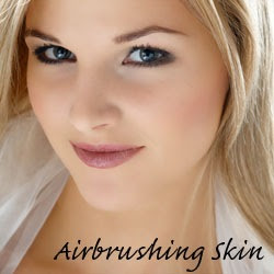
Airbrush skin like a pro. In this Photoshop retouching tutorial, you’ll learn how to retouch skin like the professionals. Find out how to make skin look healthy without looking plastic or blurred.


Step 1


Open the photo into Photoshop. For this tutorial, try to use a high resolution image where you can see the skin texture.


Step 2

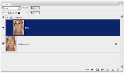
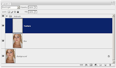
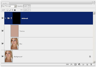
Create a duplicate layer and put it into a group. To do this, press Ctrl+J to duplicate the layer then Ctrl+G to place the new layer into a group. Name the group "Airbrush" and the layer "Blur". To retouch the skin, there will be two layers in the Airbrush group. The first layer we’ve created (the Blur layer) will be used to blur the skin. After that, we’ll add another layer to restore the natural skin texture.


Step 3

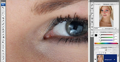
Have the Blur layer selected. To blur this layer, use the Surface Blur filter. This filter blurs like the Gaussian Blur filter except it can retain edge detail. We’ll need to blur the layer so that the skin is smoothed and somewhat blurry without having the edges


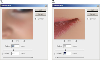
Here’s what my image looks looks like after the Surface Blur filter. Your image should look similar with details such as the eye intact. If the eye becomes blurry, your settings are too strong. Undo and redo the Surface Blur filter with a lower setting.


Step 4

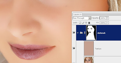
Create a new layer and move it above the Blur layer. Name this layer "Texture" and change the blend mode to Hard Light. This layer, as the name states, will be used to add a slight texture to the skin and also adjust the skin tonality.


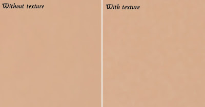
The texture created in this layer will contribute to the final results very minimally - the difference can only be easily seen zoomed in on high resolution images and varies from image to image. Even though the result is very minimal, it ensures that no area of the skin looks too smooth or plastic.
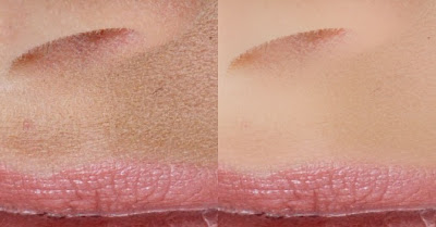
Below is an example of this. On the left, the image looks like a solid color, also known as plastic skin. The image on the right has a slight noise pattern to make the skin look more realistic.


Step 5

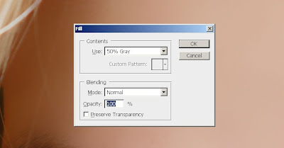
Make sure that you have the "Texture" layer selected. With that layer selected, press Shift+F5 or choose Edit > Fill. In the Fill tool, set the settings according to the image below. This will fill your layer with a 50% gray color.


Step 6

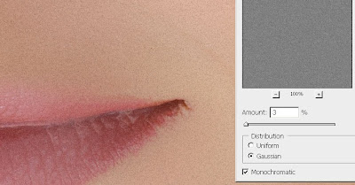
Open the Add Noise filter from the Filter > Noise menu. Enter in the settings shown in the image below. This will add some noise to the image that will prevent skin from looking plastic. It may look a little too sharp, but in the next step, we’ll fix this with a Gaussian Blur filter.


Step 7

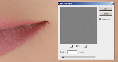
Choose Filter > Blur > Gaussian Blur. Blur the layer by 1 pixel.


Step 8

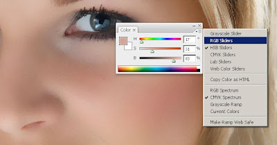
Now we’ll temporarily tint the color of this layer. First, select the Eye Dropper tool from the toolbar. Sample an area on the skin that appears to be the average skin color. You don’t have to be very precise because we will tune the color later in the tutorial. In the Color palette, click on the flyout menu below the close window button and select HSB sliders. We’ll need to see the HSB values for the next step.


Step 9

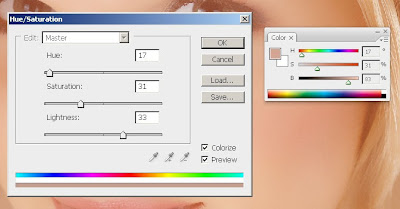
Open the Hue/Saturation tool by pressing Ctrl+U or choosing Image > Adjustments > Hue/Saturation. Check the Colorize option and adjust the hue, saturation, and lightness values to match the HSB values from the color we sampled in the previous step. For the brightness, set this to


Step 10

Select the Airbrush group in the Layers palette and add go to Layer > Layer Mask > Hide All. This will create a layer mask filled with the color black that will hide the group. With this layer mask, we’ll paint the areas were we want the skin to appear. Otherwise, this skin airbrushing effect will appear on the entire image.


Step 11

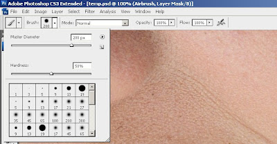
First, press D on your keyboard to set the foreground and background colors to the default black and white. Select the Brush tool and apply the settings below.


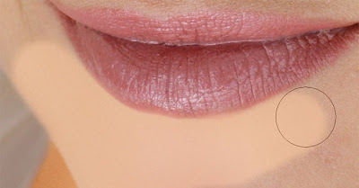
Zoom in to 100% and paint over the skin. The parts that you paint will appear smoother with a different skin tone. Don’t worry if the skin tone doesn’t look correct. This is because we didn’t pick the correct color when we used the Hue/Saturation to tint the "Texture" layer. It’s too difficult to do that without a preview, so we’ll fix that later.
When painting, you’ll need to change the brush size and hardness frequently. It would be tedious to always access the brush option menu to do this so take this as an opportunity to use hot keys. Use the following hot keys to help you with modifying the brush size and hardness:
• Decrease brush size: [
• Increase brush size: ]
• Decrease brush softness by 25%: Shift + [
• Increase brush softness by 25%: Shift + ]


When you’re done, your layer mask should have the skin areas in white and the skin should look smooth.


Step 12

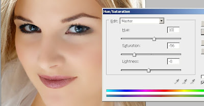
Now we’re going to fix back the color and tone of the skin as we mentioned earlier in the tutorial. Select the "Texture" layer and press Ctrl+U to access the Hue/Saturation tool. Alter the settings to get a natural looking skin tone.
• The Hue setting is usually correct. I increased it by 10 to add more yellow to it to make the appearance of the red areas less visible.
• The Saturation setting usually needs to be reduced greatly. Adjust this until the skin tone looks natural but not too pale.
• The Lightness setting requires slight modification. A slight change in the lightness will create big difference in how the skin blends in with the image. As you adjust the setting, you will see how sensitive this setting is. Even though it requires high precision, it is easy to tell when it is the correct setting. If it is off, it will look really off. If it is at the correct setting, it will look a lot more natural.


Step 13

Finally, we’re going to restore the skin details. Choose Image > Apply Image. Use the settings below.


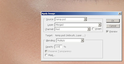
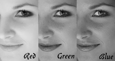
The reason why we’re applying data from the Red channel is because it contains the least skin imperfections. The image below shows the difference in the channels. The red channel hides many of the skin imperfections that are visible in the green and blue channel.


Final Results

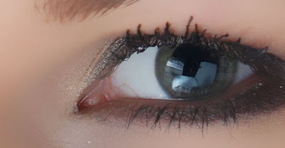
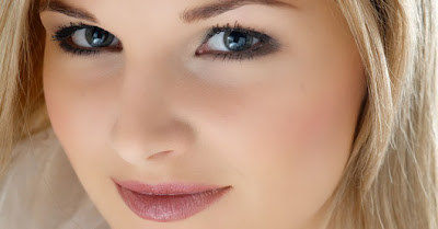
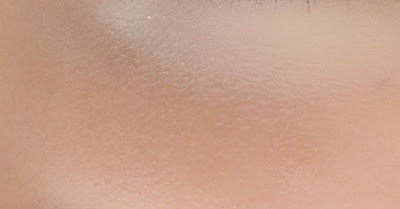
Here’s the final results after applying this airbrushing technique. In the image below, you can see how smooth the skin looks. Because the image below has been downsized to fit into this tutorial, it may look slightly plastic. However, when zoomed in, the texture is clearly visible.


This is a crop of an area zoomed in 100%. The tiny skin bumps are still visible. Even near the bottom right of the image, it still looks natural because of the "Texture" layer that we added. Without that layer, that area would appear as a solid color with no noise.


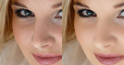
And as usual, here are the before and after images.